
-1.png)
.png)
.png)
.png)
.png)
.webp)
.webp)

_11zon.webp)
%201%20(1).webp)
.webp)
%20(1).webp)
_11zon.webp)
_11zon.webp)

_11zon.webp)

_11zon.webp)
_11zon.webp)
_11zon.webp)
.webp)
%20(1).webp)

%20(1).webp)
_11zon.webp)
.webp)
_11zon.webp)


Let's get down
to business
Your Location: Milky Way, Earth


Privacy & Cookies Policy
Cosmos Studio © 2023
Copy email
Copied
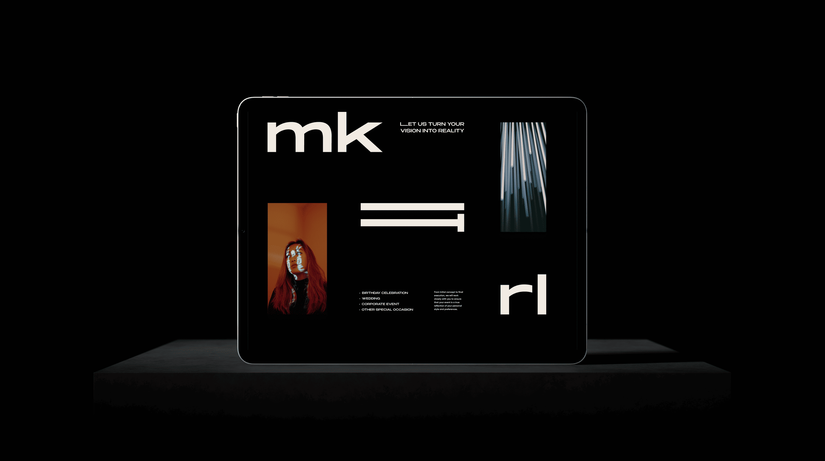
Our task was to create a visual identity for the main Make it Real brand – one that feels bold, minimal, and flexible enough to scale across future sub-brands. The challenge was to develop a strong core system that could stay consistent while allowing space for distinct voices.
We built a clean, typographically driven identity based on minimalism, a muted color palette, and structured layouts. The logo and visual system rely on stretched lettering and strict grid principles to ensure adaptability and recognition. This approach laid the foundation for future brand extensions – each sub-brand gets its own colors and tone, while preserving the structural DNA of the main brand.
.webp)

%20(1).webp)
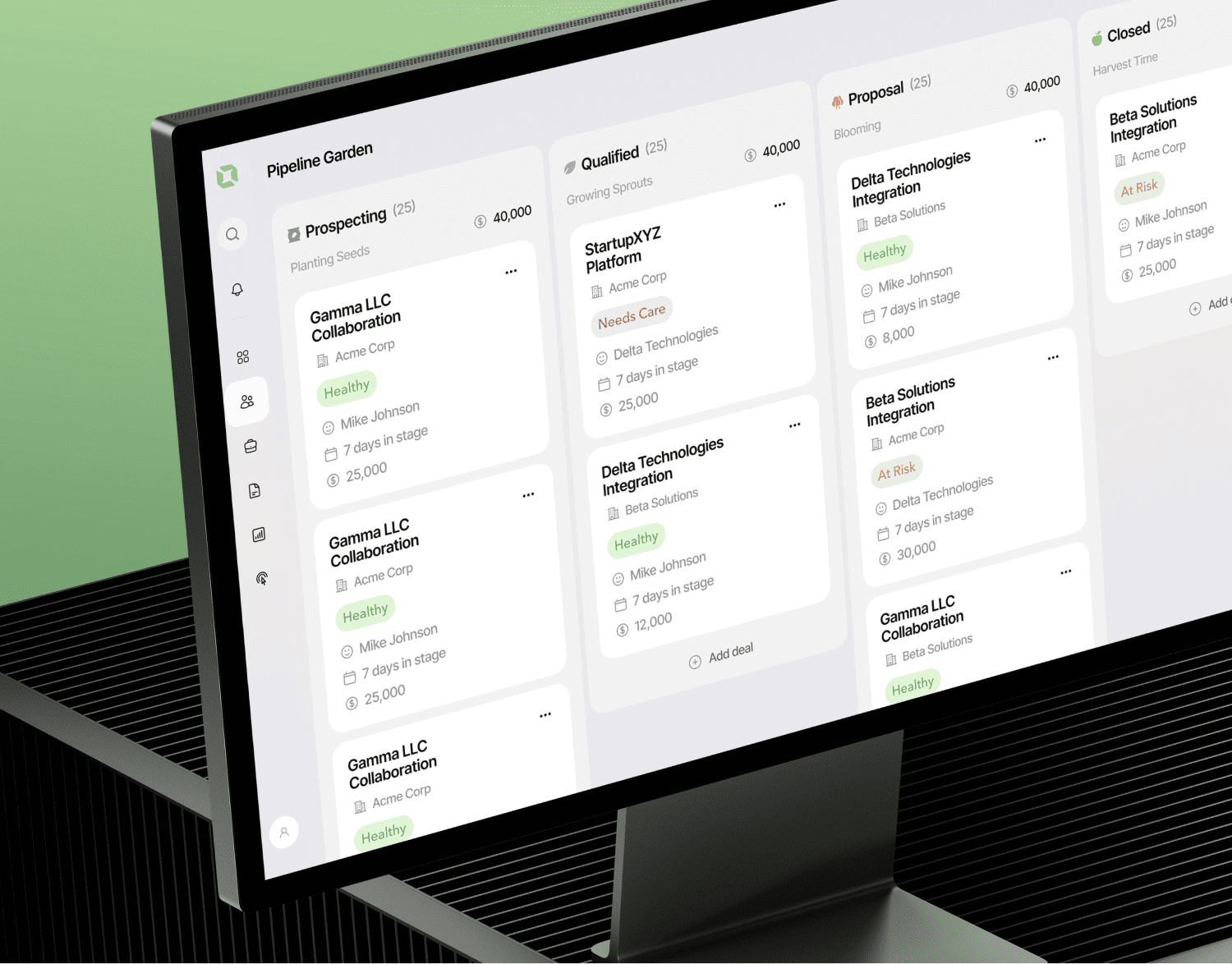
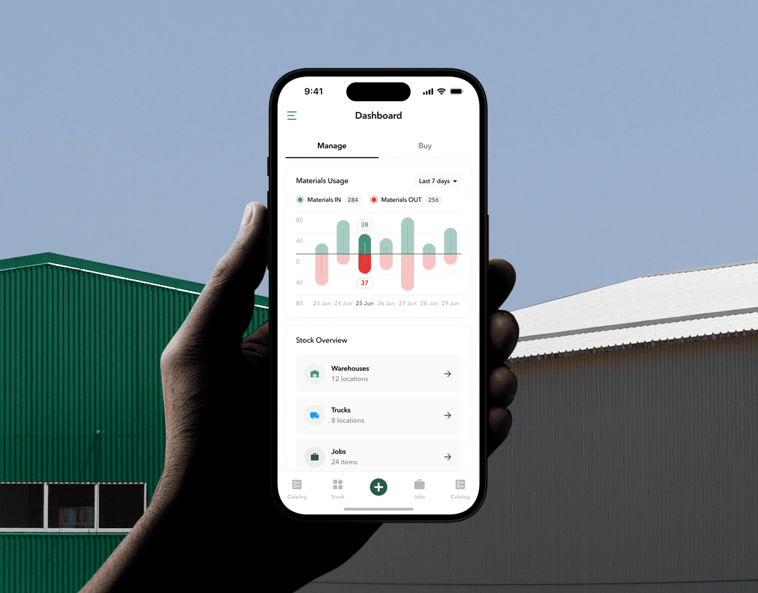
The main brand uses a restrained color palette and minimalist design. In contrast, each of the 7 sub-brands has its own distinct style and color scheme, making them unique. Despite these differences, all brands share a unified typographic style, consistent visual techniques like letter expansion, and common compositional principles.

.webp)
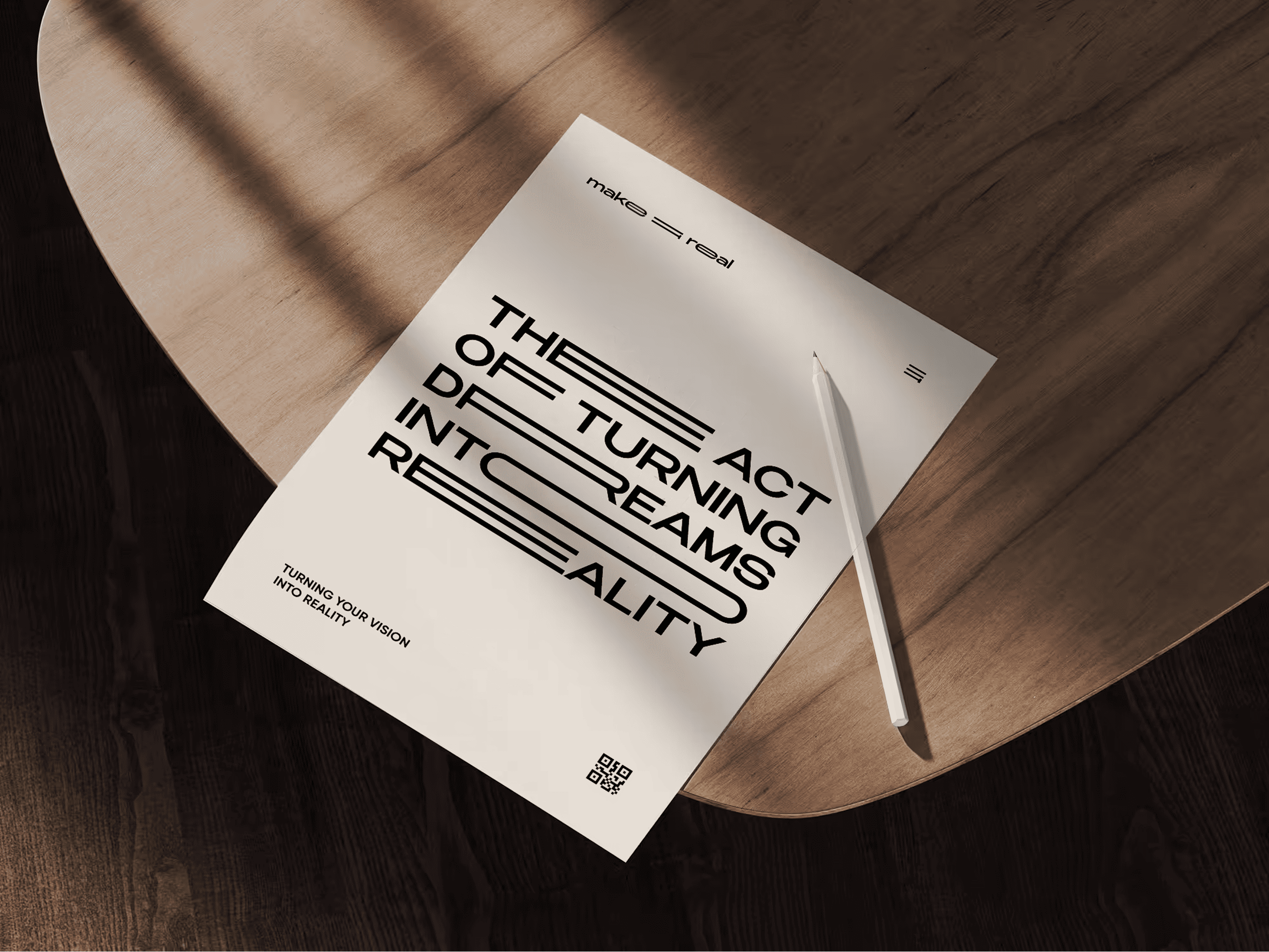
We designed the logo in three different forms. The horizontal version is ideal for wide formats such as banners. The vertical version works well for media like mobile screens and posters. The short version is a compact logo suitable for small spaces, such as social media avatars or small-scale printed materials.

.webp)
.webp)
.webp)
.webp)
.webp)
.webp)
.webp)
%20(1).webp)
.webp)
.webp)
.webp)
