C2 interface design: how to build C2 and ISR software operators trust


C2 interface design that operators trust: how to show data age, source and confidence, work with operators, control alerts and test designs with failures.
Key takeaways:
- Aim for calibrated trust: operators should rely on a C2 system as much as its real capability deserves.
- Every fact on a C2 or ISR screen should show how old it is, where it came from, how sure the system is and who can act on it.
- Stay in contact with operators from the start, including on multi-monitor setups, so their feedback goes straight into the product.
- Test trust with failures: stale tracks, wrong recommendations, lost networks and alert floods.
C2 interface design is the work of arranging maps, tracks, tasks and decisions so an operator can read the situation and act on it. Operators trust a command and control interface when it shows how old each fact is, where it came from, how sure the system is and who can act on it. The same four answers apply to ISR software.
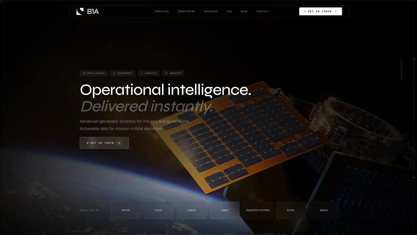
I run Cosmos Studio, a UI/UX studio that works with defense tech companies. We have not shipped an operational C2 system, so here is where this guide comes from: human factors research, published C2 design guidance and our closest project, the Bravo1Alpha analysis platform, which is map-heavy and role-based, with MIL-STD-2525 annotations and structured reports.
What are C2 and ISR interfaces?
C2 (command and control) software helps a team see the situation, assign tasks and track decisions. Its core screens are the common operational picture, unit and asset status, tasking and orders, messaging and shift handover, and decision logs.
ISR stands for intelligence, surveillance and reconnaissance. ISR software helps analysts review sensor and imagery data and turn it into reports. A C2 user mostly asks "what do we do next?" An ISR analyst mostly asks "what am I looking at, and how sure am I?" Many products serve both users, so one interface has to answer both questions.
What does operator trust mean in a C2 interface?
Start with Lee and See's 2004 review, which defines trust as "the attitude that an agent will help achieve an individual's goals" in "a situation characterized by uncertainty and vulnerability." Their central idea is calibration, meaning how closely a person's trust matches what the automation can really do.
Overtrust leads to misuse, and distrust leads to disuse: a good tool gets ignored. So the design goal is accurate trust. A polished screen that hides uncertainty pushes operators toward overtrust.
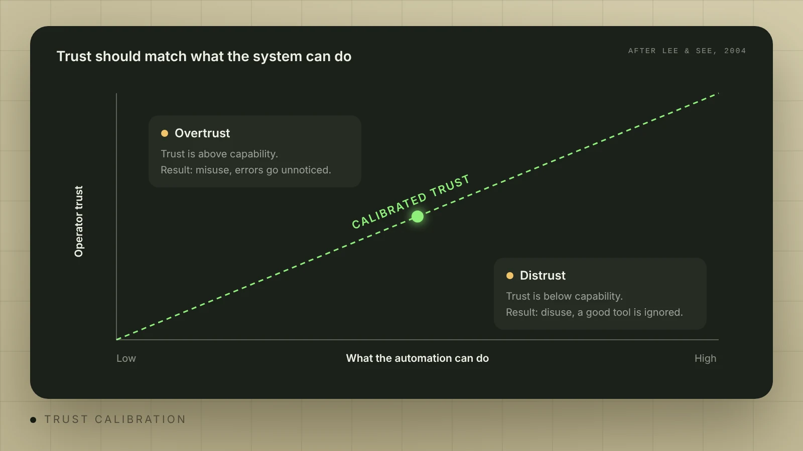
Workload makes this worse. Parasuraman and Manzey (2010) write that automation complacency "occurs under conditions of multiple-task load", and that automation bias causes "both omission and commission errors when decision aids are imperfect." In plain words, a busy operator stops checking, misses what the system missed and follows advice that is wrong. C2 work is multi-task work, so plan for both errors.
Situational awareness gives you a second check. Endsley's model has three levels: perceiving what is there, understanding what it means and projecting what happens next. Many status screens stop at the first level.
Seven questions every C2 screen should answer
Use these questions to review any screen. If an operator cannot answer one in a few seconds, the screen has a trust problem, however clean it looks.
| What the operator asks | What the interface shows | What it looks like when it fails |
|---|---|---|
| How old is this? | Age in numbers, last update time, separate live, delayed and offline states | An old track looks the same as a new one |
| Where did it come from? | Source name and one click to the raw feed or image | Merged data with no visible origin |
| How sure is the system? | Confidence in plain words, with the reason | A bare "87%" nobody can interpret |
| Who can act on it? | Role, authority and who confirmed | Everyone sees the same buttons, and no task has an owner |
| What happens if I do this? | A preview of the result and a clear confirmation for critical actions | The same dialog for a filter change and a critical order |
| What changed while I was away? | A handover summary with open tasks | The next shift scrolls through chat |
| Who decided this, and when? | A log with time, author and context | Decisions live only in voice calls and messages |
The US Department of Defense sets a similar bar. Directive 3000.09 (effective January 25, 2023) covers autonomy in weapon systems, but its interface wording works as a test for any operator software: the interface must "be readily understandable to trained operators", "provide transparent feedback on system status" and "provide clear procedures for trained operators to activate and deactivate system functions."
Should C2 screens follow tasks or functions?
Many C2 products grow screen by screen: one window for the map, one for tracks, one for messages. A 2012 design guide from Lemon and Cowen at SSC Pacific, a US Navy lab, describes the result: "The user must hunt for information and remember the procedural steps involved with a task." Their rule is that C2 operation "must be driven by what needs to happen next in the command environment."
In their redesign example, multiple windows were reduced to four. One slide contrasts a function-based system where "users see 90% of the data" with a task-based one that "provides 10% of data as required."
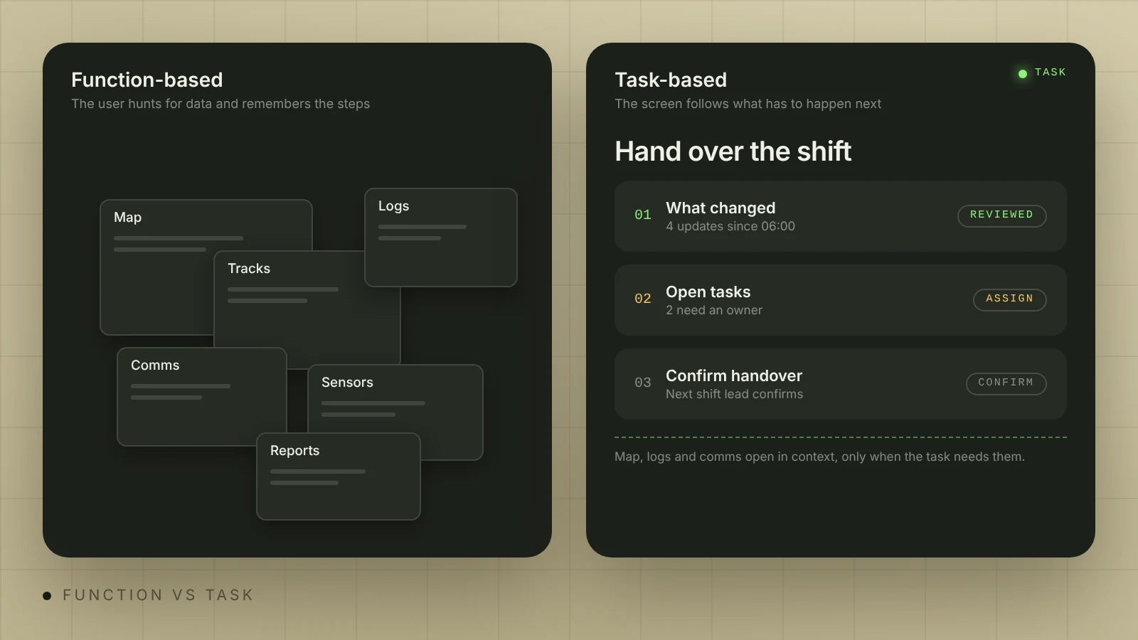
The approach has a limit, and the authors name it: "Task-based design will be less effective for complex tasks that are poorly defined or too general." So treat task-based design as one option and check it against how operators really work. Exploratory analysis, for example, rarely fits a fixed flow.
The layout decision belongs with the operators. We start every C2 project by mapping roles, decisions and data sources with them, because the design has to follow how the team really works. Check early how the interface behaves across several monitors.
 Illia KulbachnyiCEO at Cosmos Studio
If your product has grown screen by screen, a UX audit takes 1–2 weeks and shows where people switch between too many views.
How do you show data freshness and confidence?
Old data that looks live breaks trust fastest, because the operator sees the error only after acting on it. A 2026 AHFE paper on counter-drone interfaces by Doroftei, De Cubber and Depreytere lists "clear presentation of uncertainty and data freshness" among its design principles. An earlier AHFE paper by von Kelsch, Kane and Muller (2017) proposes expiration dates, validity timespans and icons on outdated mission data. Its authors report only informal evaluations, so test these patterns with your own users.
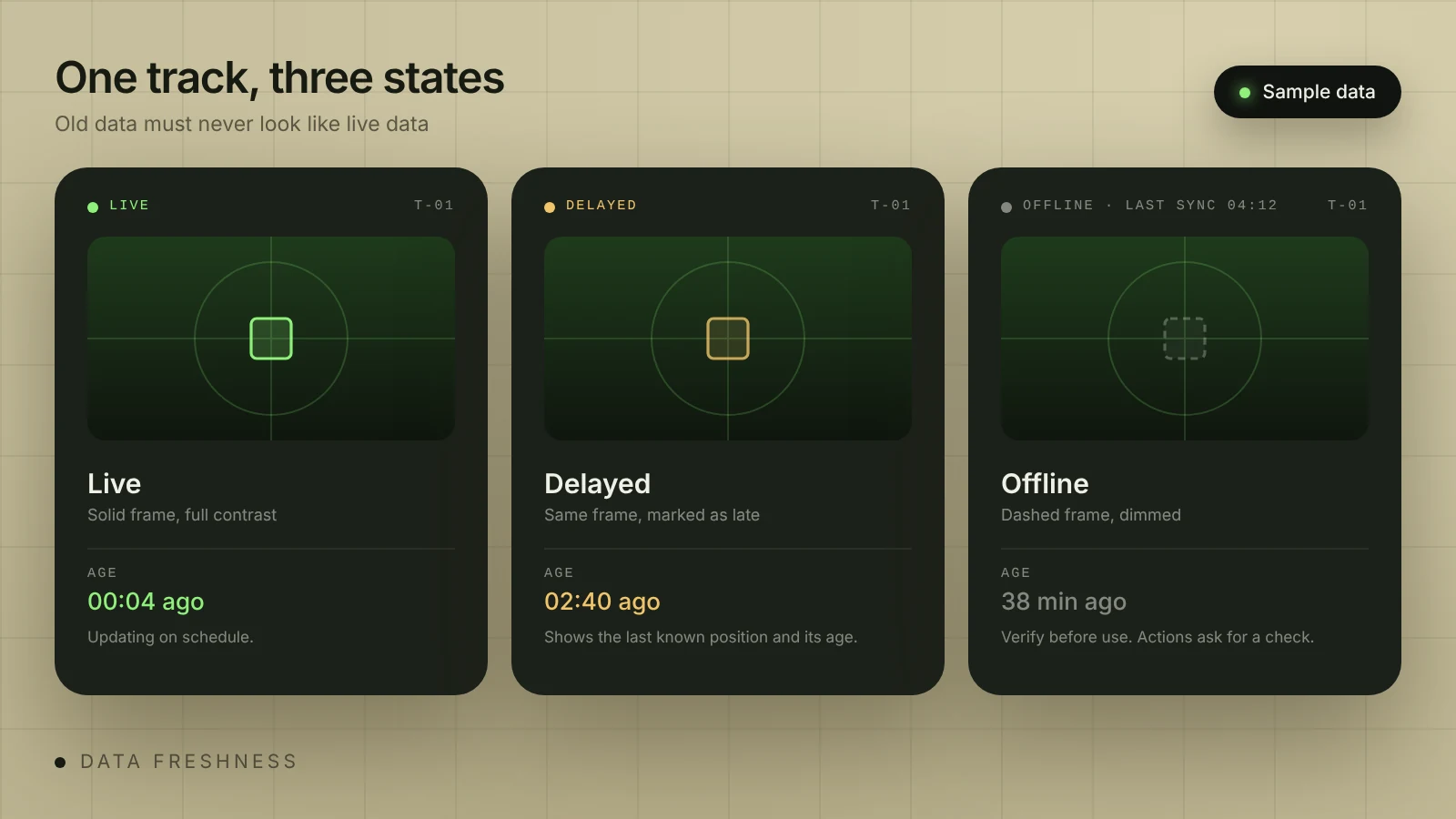
We design live, delayed and offline data as separate visual states, so old information is never mistaken for a live update. In practice:
- Show age as a number next to anything an operator might act on ("02:40 ago").
- Change the shape as well as the color, for example a dashed frame. Color alone is easy to miss on a rugged tablet in poor light.
- Set staleness limits per data type with operators. A position report and a satellite image age at different speeds.
- Replace bare percentages with a reason: "Medium: one sensor, no visual check" tells an operator what to do next.
- Keep the raw source one click away, so the operator can verify the claim.
The same applies to AI output in ISR tools. DARPA's Explainable AI program set the aim that users "understand, appropriately trust, and effectively manage" AI partners. On a screen, that means an AI detection comes with its evidence, the operator can reject it in one action, and the system records the rejection. Our AI agent UX work uses the same parts: approvals, logs and error recovery.
How do you stop alerts from turning into noise?
I found no public alert benchmark for defense software, so the closest numbers come from other industries. Chemical Engineering reports that the process-industry standards EEMUA 191, ISA-18.2 and IEC 62682 treat "up to 12 alarms per hour" as the maximum manageable for an operator. EEMUA 191 defines the start of an alarm flood as a 10-minute period with more than 10 new alarms.
In healthcare, a 2020 systematic review of computerized physician order entry found average override rates of 46.2% to 96.2%. Across those studies, clinicians dismissed from about half to nearly all of the warnings they got. Neither figure is a target for C2, but both show what happens when alerts outrun attention.
Rank alerts by severity and confidence, and group those from one event into one item. Track two numbers from the first pilot: alerts per operator per hour, and the share dismissed without action. If the second number keeps growing, operators have stopped reading.
How should maps and symbology work?
Use the standard your customer requires, usually MIL-STD-2525 or NATO APP-6, and keep one version across the map, lists and reports. We add custom symbols only when the standards do not cover a specific need. Operators read these symbols by habit, so a redrawn symbol costs recognition.
A correct symbol set does not make a usable screen. As the SSC Pacific authors put it, "Style guides do not ensure usability of the UI." Most map problems are about density, so give each role its default layers, keep filters and time controls consistent, and declutter when many tracks appear at once. Offer dark, high-contrast modes and test the layout on multi-monitor setups, laptops and rugged tablets. Our defense software UX work covers these screens for C2, ISR and GEOINT products.
How do authority and decision logs build trust?
An operator also has to trust the team around the screen. The interface should show who can order what, who received a task and who confirmed it. Scale friction to the consequence: routine actions take one click and can be undone, critical actions need a clear confirmation that names what will happen.
Then record it all. A decision log with time, author and context answers questions after the fact and supports after-action review. Add AI recommendations to the log too, including which ones the operator rejected. Handover belongs here: messages linked to map objects and tasks, plus a summary of what changed and what is still open.
How do you test operator trust before launch?
A normal usability test measures whether people can finish a task when everything works. Trust shows up when something fails, so run scenarios on synthetic data with real operators or former operators and break things on purpose:
- Age one track without warning. How long until someone notices?
- Show a wrong recommendation. Does the operator accept it?
- Hide one detection. Does anyone catch the gap?
- Cut the network. Can the operator tell what is still live?
- Send more than 10 alerts in 10 minutes. What gets missed?
- Swap operators mid-scenario. Can the new one explain the situation and the open tasks?
Doroftei and colleagues propose operator-centered measures for this kind of test: acknowledgment and tracking times, verification timing, alert quality, stability under load and evidence completeness. Compare results between design versions. You do not need classified data for any of this, because layouts and flows can be tested with sample data while real data stays with your cleared team.
Where our experience helps, and where it ends
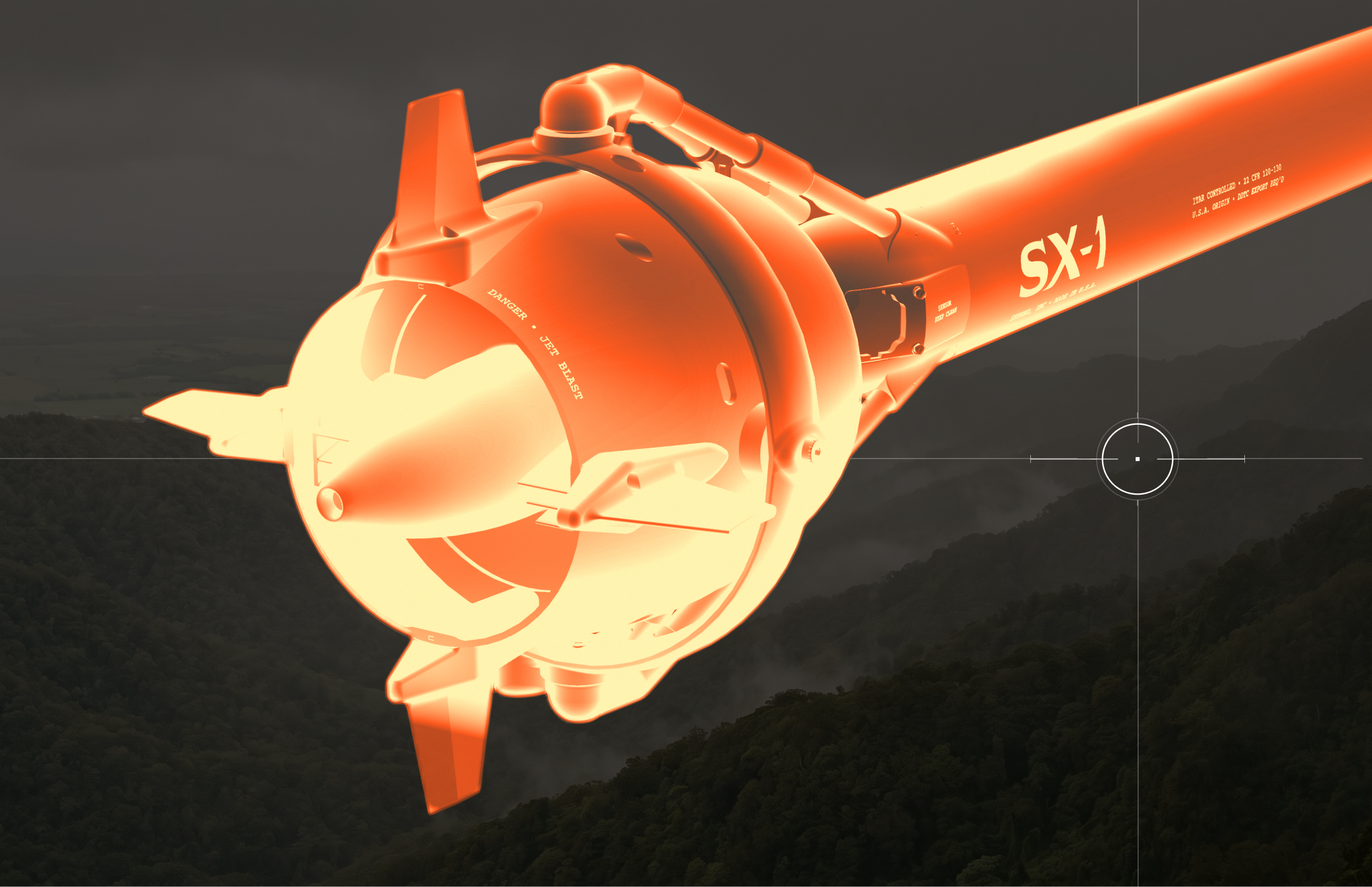
Our closest work is the Bravo1Alpha platform, where analysts work on maps with MIL-STD-2525 annotations and turn them into structured reports. For SerenX we built the website, where each app works like a live instrument, including the map of the KALDREX command product. That is a marketing site, so it shows how to explain a C2 product to buyers. It is not field software.
We hold no security clearances, and we have not shipped an operational C2 system. We work under NDA on the unclassified parts of a system, with sample data, and hand over designs and React code your cleared team can integrate. If you need a team inside classified networks, our comparison of defense tech design agencies names firms that work on federal contracts, and our guide to choosing a UI/UX agency for defense tech covers what to ask them.
For C2 interface design, projects start at $5,000 and rates at $50 an hour (see pricing). Core workflows usually take 4–8 weeks, and larger systems ship in stages. To get an estimate, send us your current screens or a short product description through the contact page.
Sources
- Lee and See: Trust in automation, Human Factors, 2004
- Parasuraman and Manzey: Complacency and bias in human use of automation, Human Factors, 2010
- Green, Armstring and Mantua: Scientific measurement of situation awareness in operational testing, ITEA Journal, 2023
- US DoD Directive 3000.09, effective January 25, 2023
- Lemon and Cowen: A task-based design guide for command and control, ICCRTS, 2012
- Doroftei, De Cubber and Depreytere: Human factors in the design of HMIs for counter-drone systems, AHFE, 2026
- von Kelsch, Kane and Muller: Techniques for managing stale mission information, AHFE, 2017
- Gunning: DARPA Explainable AI program update, 2017
- Chemical Engineering: Alarm management by numbers
- Poly et al.: Appropriateness of overridden alerts in CPOE, JMIR Medical Informatics, 2020
{{contact}}
FAQ
What is C2 interface design?
It is the design of the screens people use to command and coordinate operations: the common operational picture, unit status, tasking, messaging, handover and decision logs. The goal is that a team reads the same situation and agrees on the next step quickly.
What makes operators trust a C2 interface?
The interface has to be accurate about its own limits. It shows the age and source of each fact, explains how sure the system is, makes authority clear and records decisions. Trust should match what the system can really do, so operators keep checking where it is weak.
How do you design a C2 interface for poor or disconnected networks?
Give live, delayed and offline data different visual states, and show the age of each item as a number. Keep the last known data on screen with a clear label, and ask for a check before a critical action on old data.
Does C2 software need MIL-STD-2525 or NATO APP-6 symbols?
If your users already read them, yes. Use the standard and version your customer requires, and add custom symbols only where the standard has a gap. A correct symbol set does not make the screen usable on its own, so test density and layers as well.
How much does C2 interface design cost?
At Cosmos Studio, projects start at $5,000 and hourly rates at $50. A UX audit of an existing system takes 1–2 weeks, and core workflows usually take 4–8 weeks. Send us your current screens for an estimate.
Sources




Start your project with Cosmos™
Drop us a message, Anna reviews every brief personally and gets back to you within one business day. From there it's simple: we align on scope, sign the contract, and book your start date. Fast, clear, no back-and-forth.