


Military symbology for UI designers: MIL-STD-2525 vs APP-6, SIDC codes, frames and colors, dark-map legibility, decluttering and symbol rendering libraries.
Key takeaways:
- MIL-STD-2525 (US) and APP-6 (NATO) define what a symbol means and how a code becomes a picture; keeping thousands of symbols readable on a screen is a separate UI design job.
- The current editions are MIL-STD-2525E and APP-6(E), but many products still run on 2525D or APP-6(D), so design for the edition in your contract.
- In framed symbols shape carries identity and color repeats it; in unframed symbols color is the only signal, so add a text cue.
- Most map problems are about density: scale-dependent detail, grouping that never mixes identities, priority rules and role-based layers.
- Use a proven renderer, store codes instead of pictures, and convert mixed incoming editions to one internal edition.
Military symbology is the standard visual language for units, equipment, installations and activities on a map. Most defense software uses one of two standards: MIL-STD-2525 from the US Department of Defense or APP-6 from NATO. Both define what a symbol means and how a code turns into a picture. Neither tells you how to keep 2,000 symbols readable on a dark map, a laptop or a rugged tablet operated with gloves. That is a UI design problem, and it is where most map products struggle.
At Cosmos Studio we design map-heavy defense interfaces: C2, ISR and satellite imagery products. This guide combines the standards, the libraries engineering teams use to render them, and lessons from that work. Every fact from a standard or a tool is linked to its source.
What is military symbology?
Military symbology is a rule set for drawing objects on a map so that any trained reader understands them the same way. A symbol is built from parts:
- Frame. Its shape shows the standard identity (often called affiliation) and the dimension: land, air, sea surface, subsurface or space.
- Icon. The picture inside the frame shows what the object is, for example infantry or a radar.
- Modifiers. Small parts inside the frame refine the icon.
- Amplifiers. Text and graphics outside the frame add details such as echelon (unit size), unique designation, direction of movement or operational condition.
- Frame line. A solid line means present; a dashed line means planned, anticipated or suspected.

This split between modifiers inside the frame and amplifiers outside it comes from MIL-STD-2525D. Some older documents use "modifiers" for both, so expect mixed terms in documentation and in your team.
What do the frame shapes and colors mean?
For land units the four basic frames are well known: friend is a rectangle, hostile a diamond, neutral a square and unknown a quatrefoil. Other dimensions change the shape: air and space frames keep only the upper half of the shape, and subsurface frames the lower half. These half frames are open: air and space frames have no bottom line and subsurface frames no top line, as the NATO Joint Military Symbology overview shows. With a fill, the open side still reads as a straight edge, as in the grid below. Friendly sea surface symbols use a circle. MIL-STD-2525D also gives example fill colors in three luminance levels: light, medium and dark.
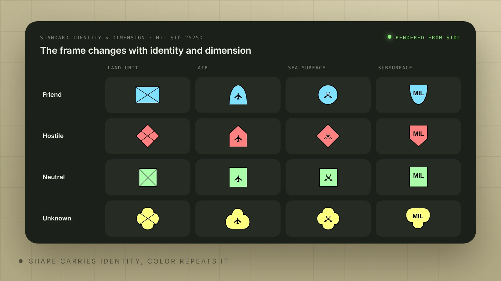
2525D lists these fill colors (light set):
| Standard identity | Land frame | 2525D fill color (light tone, RGB) | Shares color with |
|---|---|---|---|
| Friend | Rectangle | Cyan 128, 224, 255 | Assumed friend |
| Hostile | Diamond | Red 255, 128, 128 | Suspect, joker, faker |
| Neutral | Square | Green 170, 255, 170 | – |
| Unknown | Quatrefoil | Yellow 255, 255, 128 | Pending |
| Civilian (optional fill) | Depends on identity | Purple 255, 161, 255 | Not used for suspect or hostile |
The medium and dark tones (for example friend 0, 168, 220 and 0, 107, 140) are in the same table of the standard. Joker and faker are exercise identities, and 2525D notes that pending is a valid condition but not a standard identity. In software, the identity also carries a context: reality, exercise or simulation. One more rule matters for status: 2525D says that when the frame is assumed friend, suspect or pending, the status is not displayed. Check how your renderer draws these frames before you rely on a dashed line to mean planned.
Two rules from 2525D matter most for UI. First, all symbols should work in monochrome and when drawn by hand, and in framed symbols color only repeats what the shape already says. Second, in unframed symbols color is the only indicator of identity. If a screen shows unframed equipment symbols, a user with color vision deficiency or a monochrome night mode loses that information, so add a text cue in the label, tooltip or detail panel.
MIL-STD-2525 vs APP-6: what is the difference?
MIL-STD-2525 is the US standard and APP-6 is the NATO one. They share a history and moved closer with each edition: 2525D was restructured into building blocks (frame, icon, modifiers, amplifiers) and aligned more closely with APP-6(C). Differences remain in symbol sets and details; for example, ORBAT Mapper notes that, compared with 2525D, only APP-6D has a symbol set for dismounted individuals. In practice the customer decides: US programs usually name MIL-STD-2525, NATO and European programs APP-6. If a contract names an edition, design for that edition.
| MIL-STD-2525 | APP-6 | |
|---|---|---|
| Published by | US Department of Defense | NATO (Allied Procedural Publication 6) |
| Current edition | MIL-STD-2525E, 31 December 2022 | APP-6(E), first issued in 2023; renderers now target Version 2 |
| Still common in products | 2525D (June 2014) and 2525D Change 1; 2525C (2008) in older systems | APP-6(D) (2017); APP-6(B) in older systems |
| Symbol code (SIDC) | 15 characters in 2525B and C; 20 or 30 digits in 2525D | 15 characters in APP-6A and B; 20 or 30 digits in APP-6C and D; 30 alphanumeric characters in APP-6E |
| Open-source renderers | milsymbol; mil-sym-ts and mil-sym-java (2525D Change 1, 2525E Change 1) | milsymbol; mil-sym-ts and mil-sym-java (APP-6D, APP-6E icons only) |
| Esri dictionary styles | 2525B Change 2, C, D, D Change 1, E | APP-6(B), (D), (E) |
Code formats are from the Luciad developer guide, renderer support from the milsymbol, mil-sym-ts and mil-sym-java documentation, and Esri support from its military symbology styles page and June 2026 update. APP-6(E) uses 30 alphanumeric characters; check Appendix A of 2525E for its format before you implement it.
What is a SIDC and how do you read it?
A SIDC (symbol identification code) is the string software stores instead of a picture; a renderer draws the symbol from it. Older editions use a 15-character alphanumeric code. MIL-STD-2525D and APP-6D use 20 digits, with 10 optional extension digits:
| Digits (2525D) | Meaning | Example of what changes |
|---|---|---|
| 1–2 | Version | Which edition the code follows |
| 3 | Context | Reality, exercise or simulation |
| 4 | Standard identity | Pending, unknown, assumed friend, friend, neutral, suspect/joker, hostile/faker |
| 5–6 | Symbol set | Land unit, air, sea surface, control measure and so on |
| 7 | Status | Present or planned (solid or dashed frame), or a condition: fully capable, damaged, destroyed, full to capacity |
| 8 | Headquarters, task force, dummy | Adds the HQ staff, task force or feint/dummy indicator |
| 9–10 | Amplifier or descriptor | Echelon or mobility |
| 11–16 | Entity, entity type, entity subtype | The icon inside the frame |
| 17–20 | Sector 1 and sector 2 modifiers | Small marks that refine the icon |
| 21–30 (optional) | Extension | See Appendix A of your edition |
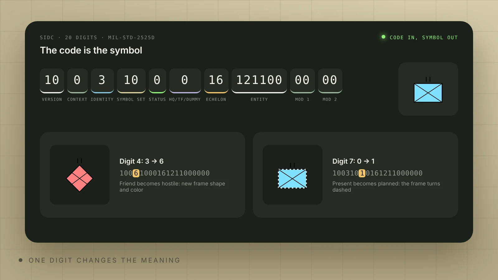
Source: MIL-STD-2525D, Appendix A. Change digit 4 and a friend becomes a hostile. Change digit 7 and a real position becomes a plan. For design this means three things. You design a system, not a set of icons: every screen must handle any valid code, including ones nobody drew in Figma. The code is data, so filters, search and grouping can use it. And the renderer is the single source of truth: when the map, the list and the report use the same renderer, they cannot disagree.
Many tactical apps exchange data in Cursor on Target (CoT), which uses its own type string built from 2525 parts. FreeTAKServer documentation gives the example a-h-A-MFA (atom, hostile, airborne, military, attack/strike) and notes that these types follow MIL-STD-2525B. If your product talks to TAK systems, plan the mapping between 2525B-style CoT types and your 20-digit SIDCs early.
Why are military symbols hard to read on screens?
The standards cover meaning and drawing rules. 2525D asks implementers to consider legibility across lighting conditions, map backgrounds, symbol sizes, display types and user fatigue, but it gives no pixel sizes. Screens add their own problems: small sizes, dark map themes, glare, night modes and red-green color vision deficiency, which affects the hostile and neutral pair. Research points the same way: in a 2014 visual search study of MIL-STD-2525 glyphs (Siva et al., Journal of Vision), participants spotted changes in line length, line orientation and the central symbol efficiently, but were not able to distinguish changes in text identifiers. Do not hide critical information in small amplifier text.
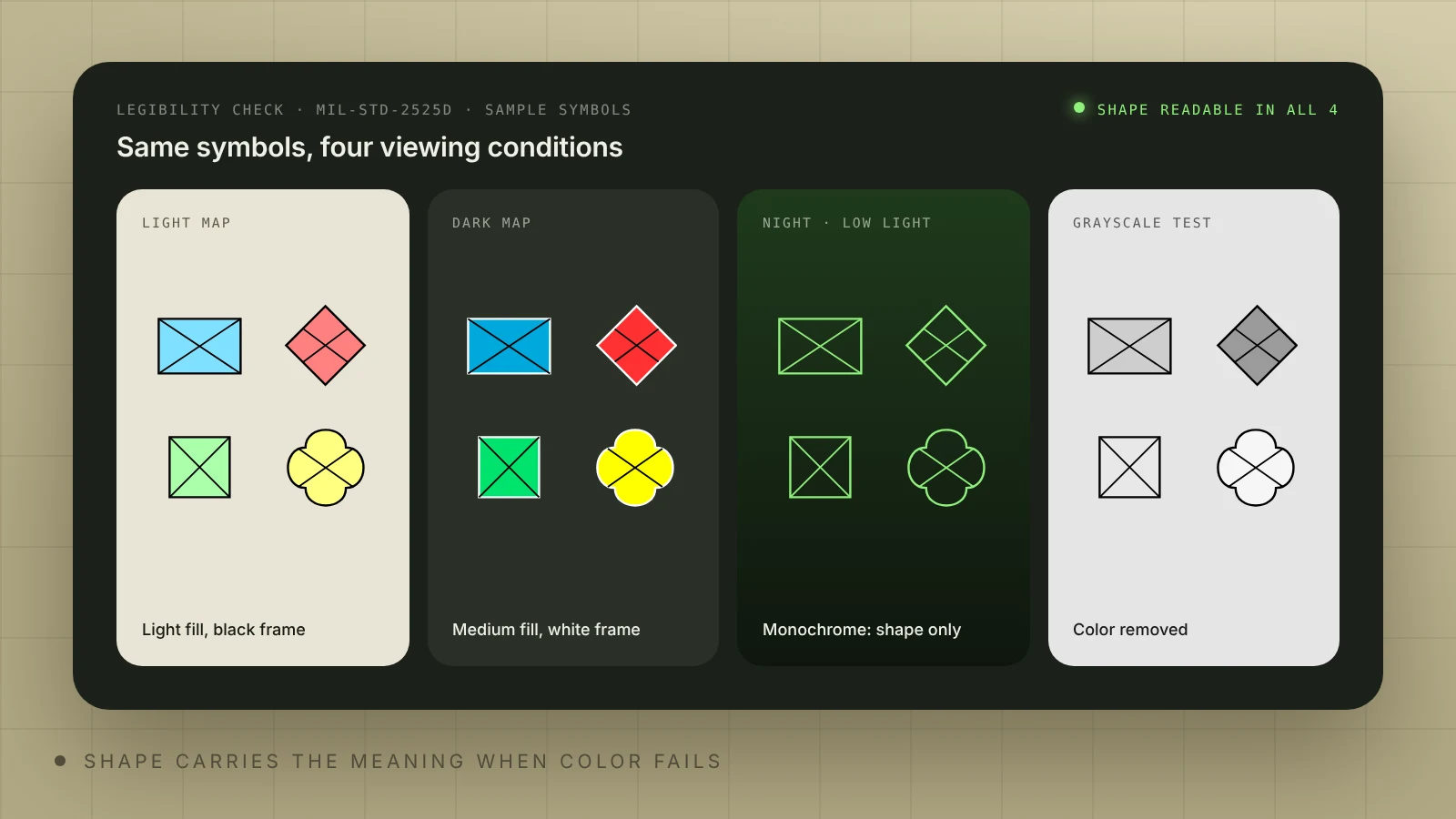
What the standard says and what we add on map screens:
- Use the standard fill sets. 2525D gives light, medium and dark fill sets as examples. Pick one set per map theme and test it on your base map instead of inventing a brand palette; operators read these colors by habit.
- Use white frames on dark maps. 2525D allows white frames and other elements when filled symbols sit on a dark background, and translucent fills at 35% opacity when symbols must not hide the map.
- Test shape before color. Render symbols in grayscale at the smallest size you plan to use. If you cannot tell a friend rectangle from a neutral square, the size is too small for that device.
- Treat night mode as a separate design. A low-light palette changes every contrast on the screen; review symbols in it, not just the base map.
- Size for the device and the hand. Readable on a desktop monitor can mean untappable on a rugged tablet, especially in gloves. The tap area can be larger than the drawn symbol.
How do you show thousands of symbols on one map?
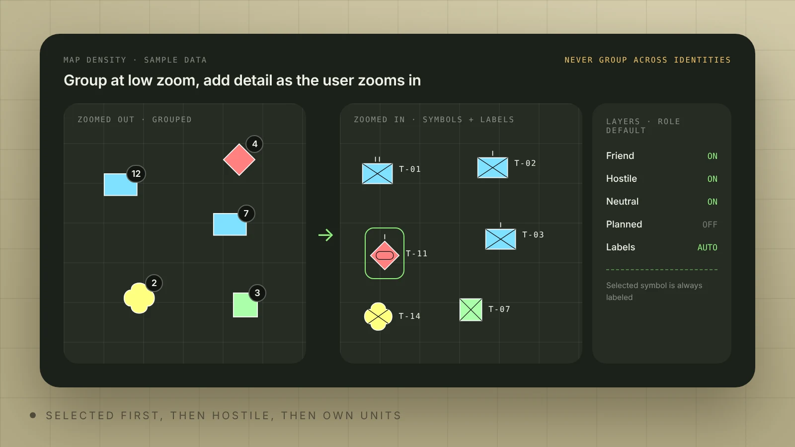
A correct symbol is useless if it sits under twenty others. Density is a constant problem on C2 maps, and the standards do not solve it. These patterns help:
- Scale-dependent detail. Zoomed out, show frame and icon only; add amplifiers as the user zooms in.
- Grouping without mixing identities. Merge close symbols into a count badge at low zoom, but never group friend and hostile into one badge.
- Priority rules. Decide what wins a collision, for example the selected object first, then hostile, then own units, then the rest, and keep the selected object always labeled.
- Role-based layers. Give each role a default set of layers and filters, so a new user does not start with everything on.
- A list next to the map. A sortable list with the same symbols helps when the map is too dense to click.
Rendering technology matters at this scale. SVG is easy to style and inspect, which suits legends, lists and detail panels. For thousands of symbols on a moving map, a common approach is to render each unique code and amplifier combination once, cache it as an image or texture atlas, and draw it in a Canvas or WebGL layer. milsymbol outputs both SVG and Canvas. Measure with your real data volume and devices before you choose.
{{case}}
How do you handle control measures and mixed editions?
2525D splits symbology into icon-based symbols and control measures: lines, areas and points such as boundaries and phase lines. On a map screen they cause their own problems. Large areas cover point symbols, so set a clear drawing order. Line labels collide with each other, so give them their own label rules. Thin lines are hard to select by touch, so widen the hit area. Editing a multipoint shape needs handles, snapping and undo. mil-sym-ts and mil-sym-java render multipoint graphics; milsymbol is built for unit symbols.
Real systems also receive data in mixed editions: 15-character 2525C codes from an older feed next to 20-digit 2525D codes. Asking for one edition per product is not enough. Convert every incoming code to one internal edition when it enters the system, keep the original code, and log codes that fail to convert, because mapping between editions is not always one to one.
What mistakes do teams make with military symbols in UI?
 Illia KulbachnyiCEO at Cosmos Studio
Each mistake has a practical counter:
- Illegible symbols: set a minimum size per device and test it in grayscale and night mode.
- Over-designing: keep the standard shapes and colors, and spend design effort on density, filters and states around the symbols.
- No contact with users: review screens with operators or former operators from the first prototype, using synthetic data only.
- No field context: test on the real device, in real light, with gloves if users wear them.
- No feedback loop: give users a quick way to report a wrong or unreadable symbol from inside the product.
Should you use a symbol library or build your own?
If a proven library supports your edition, use it. If none fits, build your own symbols or order them from a studio like ours. Redrawing standard symbols for style is rarely worth it, and it adds risk every time the standard changes.
| Option | What it gives you | Trade-offs |
|---|---|---|
| milsymbol | A small JavaScript library under the MIT license for unit symbols. Lists 2525C, D and E and APP-6 B, D and E; since version 3.0 it renders as closely as possible to 2525E. SVG and Canvas output | Map layers, grouping, labels and control measures are your work |
| mil-sym-ts / mil-sym-java | Renderers from the Mission Command project for 2525D Change 1 and 2525E Change 1, APP-6D and partial APP-6E (icons only), including multipoint graphics. TypeScript, Java and Android | Heavier setup; best when you also need control measures |
| Esri dictionary styles | Symbols drawn from codes or attributes inside ArcGIS, from 2525B Change 2 to 2525E and APP-6(B) to (E) | Best when the product already runs on ArcGIS |
| Custom symbols | Full control for objects the standards do not cover | You own every change, test and edge case. Keep them visibly separate from standard symbols |
Whatever you choose, render symbols in one place in the code, convert incoming codes to one internal edition, and write the edition into your product documentation. Our guide to C2 interface design covers the wider screen around the map: data age, sources, confidence and alerts.
What should you check before release?
A short checklist for any screen that shows military symbols:
- The contract names a standard and edition, and the renderer supports exactly that edition.
- Every symbol on screen comes from a SIDC through one renderer; nothing is drawn by hand in the UI layer.
- Incoming codes in other editions are converted on entry, and failed conversions are logged and visible to admins.
- Each map theme uses one of the 2525D fill sets, with white frames on dark backgrounds.
- All four standard identities are readable in grayscale and in night mode at the smallest size you use.
- Unframed symbols have a text cue for identity in the label, tooltip or detail panel.
- Grouping never mixes identities, and the selected symbol is always visible and labeled.
- Tap targets work on the real device with gloves, and control-measure lines have a wider hit area than their stroke.
- Users can report a wrong or unreadable symbol from inside the product.
How do you design map screens for gloves and harsh conditions?
The hardest map task we solved was for Bravo1Alpha, a defense tech company that turns satellite imagery and geospatial data into intelligence (GEOINT and IMINT). On its satellite platform the operator works on the map, many things overlap, several types of interface sit on one screen, and people use it in gloves and in difficult conditions. The work was less about the symbols themselves and more about what sits on top of what, and how to operate it in gloves.
The visuals below come from the Bravo1Alpha website we designed: data panels and detection results layered over satellite imagery. The full project is in our Bravo1Alpha case study.
What helps on such screens: decide the drawing order of imagery, symbols, lines and panels before styling; make tap areas larger than the drawn symbols and give lines a wider hit area than their stroke; keep the main actions reachable without precise taps. Then design the states around the symbols: density, selection, filters, night mode and offline work. Our defense software UX design service covers C2, ISR and GEOINT screens, and space and GEOINT UI/UX covers satellite imagery products. For budgets, see our pricing page, or send your current screens through the contact page.
Sources
- Wikipedia: NATO Joint Military Symbology
- EverySpec: MIL-STD-2525D Joint Military Symbology, June 10, 2014
- GlobalSpec: MIL-STD-2525E
- NSAI Standards: NATO APP-6 Edition E
- Luciad: Defining military symbols
- GitHub: milsymbol
- mil-sym-ts README
- mil-sym-java README
- Esri: What's new with military symbology styles, June 2026
- Esri Developers: Military symbology styles
- FreeTAKServer docs: MIL-STD-2525 and CoT
- Siva et al.: Visual search for MILSTD 2525 glyphs, Journal of Vision, 2014
- ORBAT Mapper: Military symbology
UX/UI and front-end for defense and dual-use software: C2, ISR, GEOINT, counter-UAS and drone fleet tools. MIL-STD-2525 symbology, dark modes, offline.
FAQ
What is the difference between MIL-STD-2525 and APP-6?
MIL-STD-2525 is the US Department of Defense standard and APP-6 is the NATO one. They share a history and have moved closer since 2525D, but symbol sets and codes differ between editions. Use the standard and edition your customer names in the contract.
What is the latest version of MIL-STD-2525 and APP-6?
The latest editions are MIL-STD-2525E (31 December 2022) and APP-6(E), first issued in 2023. Many products still run on 2525D or APP-6(D), so check which edition your renderer and your customer support before you design.
What is a SIDC?
A SIDC is a symbol identification code: the string software stores instead of a picture, which a renderer turns into a symbol. Older editions use a 15-character alphanumeric code; 2525D and APP-6D use 20 digits plus 10 optional; APP-6E uses a 30-character alphanumeric code.
What do the colors of military symbols mean?
Cyan or blue is friend, red is hostile, green is neutral and yellow is unknown; purple is an optional fill for civilian objects. In framed symbols the shape carries the same meaning, so color is a backup. In unframed symbols color is the only indicator, so add a text cue for users with color vision deficiency.
How do you make military symbols readable on a dark map?
Pick one of the standard's fill sets for the map theme, allow white frames on dark backgrounds, set a minimum symbol size per device and test in grayscale and night mode. Keep critical information out of small amplifier text.
Which library renders military symbols in a web app?
milsymbol is a small MIT-licensed JavaScript library for unit symbols with SVG and Canvas output. mil-sym-ts adds 2525D and 2525E multipoint graphics, and Esri dictionary styles fit products built on ArcGIS.
Can Cosmos Studio help with symbology in our product?
Yes. We design map screens, density and filter patterns and night modes around your chosen standard and library. See our defense software UX design service or write to us via the contact page.
Sources



Related articles
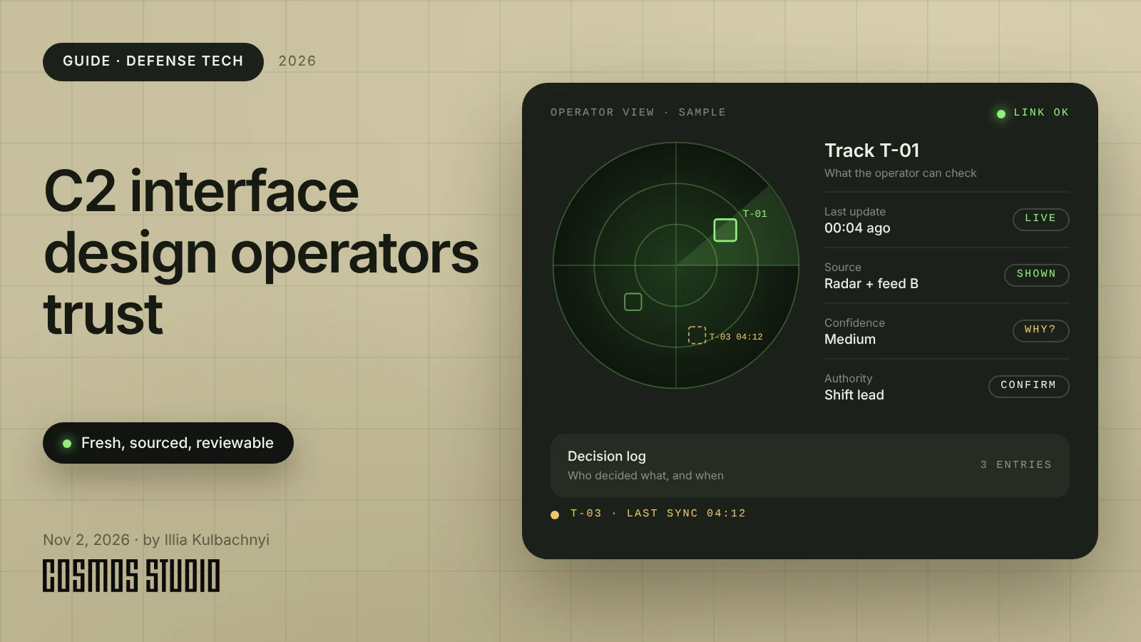
C2 interface design: how to build C2 and ISR software operators trust
C2 interface design that operators trust: how to show data age, source and confidence, work with operators, control alerts and test designs with failures.

Start your project with Cosmos Studio™
Drop us a message, Anna reviews every brief personally and gets back to you within one business day. From there it's simple: we align on scope, sign the contract, and book your start date. Fast, clear, no back-and-forth.
